

Those who work on the land always have an appreciation for seasons that city folk just don’t get. One of my farmer friends who trades futures, always likes to trade gold just before the wedding season in India. He believes the demand surges with all the bright eyed couples who insist on high grade wedding bands at that time.
Just like futures, stocks also go through seasons and patterns in how they trade. This is because business has its busier and quieter periods.
Charts are therefore a key tool in helping a trader discover where a stock is at in its trading performance and pattern. It is technical analysis and when it comes to candles, its Eastern influenced originating in Japan.
Additionally, candles are generally used for directional trading. Remember I combine directional with the mathematical equation of probability.
Technical traders use candles to look at what is driving the market, and how traders are responding to it.
What you have to realize is that each stock has a behavioral character of its own. Some jump around, have big price swings, and are a bit schizophrenic. By contrast there are slow and “steady as you go” stocks, more conservative in their price swings and less volatile. And lastly there are those in between these two extremes.
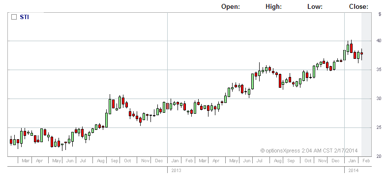
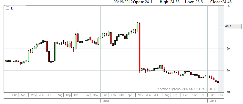
Often a trader will develop a set of favorite stocks they will trade over and over. They are familiar with how they trend and perform and with time begin to know their patterns.
SUPPORT & RESISTANCE
Stock often trade in a particular price range. Again there are always exceptions, but for stocks in companies which are ‘blue chips’ these trends generally can be observed.
Stock traders will often look at stocks for points of support and resistance.
Support refers to a strike price where a stock tends to resist pushing below. Now let me hasten to say this is not always a price that is always rock bottom. It can be a price level within the extremes where buyers tend to push the price back up.
So for example ABC stock may trade between $20 to $30. What this means is that it may get support at $20 but within that there may also be some support at $22 depending on how it’s tracked. There’s a psychological resistance in the market where the stock generally doesn’t go below that price.
However if the sellers outnumber the buyers the stock price will fall further and could possibly go to new lows. It’s then said the bears have beaten the bulls.
Conversely, resistance is the opposite. It’s a strike price where typically the stock doesn’t break through this particular price point.
Additionally, it’s been argued that many people perceive that when a stock hits resistance it will then reverse and go the other way. This isn’t necessarily so. Some purists argue that true resistance is where the stock tries to go up but continues getting knocked back. The buyers and sellers will continue in their tug-of-war. The stock may go flat for some time. Either the buyers will win and the stock goes to new highs known as a break out or a reversal will occur where the resistance holds on.
Someone once said to me think of support and resistance as a child using a trampoline inside the house.
When they bounce down they generally don’t go below a certain low point before they spring back up again.
When the bounce up they hit their head on the ceiling and generally don’t go beyond that breaking point.
Comical I know! But you get the picture!
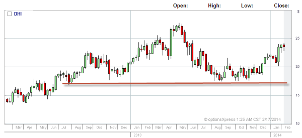
The above diagram shows a red trend line of support. This price point of support has existed over the last year and half around the $18 mark. While it was below this price in the 2012 year before ascending to this new level it has found support over time at this price point.
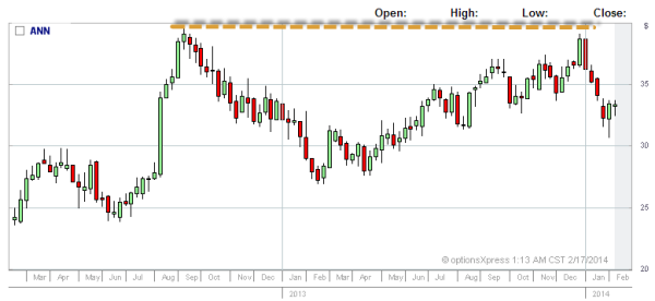
Conversely, the broken trend line on the chart below shows resistance at the price of $39. This stock over the last two years has not exceeded the $40 mark, which is helpful for traders to know when determining whether to take a trade or what strike price they would like to enter.
Optionalpha.com highlights 3 important reasons why support and resistance levels can be strong:
- Length of time
- Volume
- Recent levels
Length of Time – The longer back in time the support/resistance level holds the more significant it can become going forward. It could mark a perceived value the market prices the stock at.
Volume – Breakouts past or below strong support/resistance levels are noteworthy as they can show where additional buyers/sellers are needed to get it through that strike point. A trader may want to note that volume moving forward.
Recent Levels – The more recent a support/resistance level is the more significant it can be. This is probably of more interest to day traders rather than option traders who are trading over a few weeks to a couple of months.
THE DIFFERENT CHARTS
With all charts there are different settings you can utilize to track the pattern of a chart.
I prefer to start with a 2 year weekly chart with a 14 day moving average when looking for a trade.
This allows me to see how the stock has performed over a longer period of time without losing too much detail. Weekly charts condense the patterns as there are extensive price movements over a day, and I generally want to see where it is in that pattern. A day trader will of course have different chart needs than an options trader.
Option traders are generally trading in monthly patterns. I trade 6-8 weeks from expiry as there is better premium there and more opportunity to mitigate a problem if one arises. The more you are paid upfront from an options trade the more room you have to ‘morph’ or ‘roll down’ which we’ll show you later.
There are 3 basic charts that are used. They are line, bar, and candle charts.
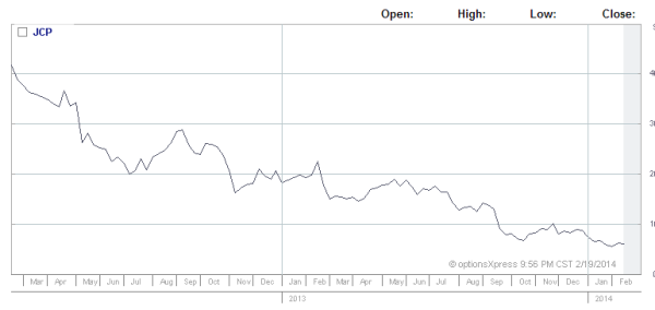
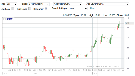
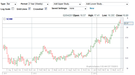
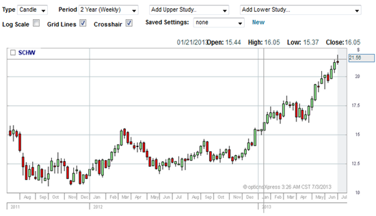
I generally use line and candle charts. Candle charts are more static and I use them as an overall assessment in trying to determine the direction a stock MAY go. I find line charts useful while the market is live as it shows a trend.
Sometimes I will do my initial assessment with candles. I wait until the market is open and look for confirmation that the market is moving in the direction I believed it might.
Additionally, I will change the settings from a 2 year chart to a day chart in this instance. At this point in the trade I want to know the exact price point. The disadvantage of the line chart at this time is that a small price movement can sometimes appear over emphasized especially at open. Eg a 5c price drop or rise which may not be significant can look like a greater movement graphically than it is in reality.
I will also use a line graph if I want to monitor a trade once I’m in it. The advantage is that I can get an overall feel for how the stock is trending on the day.
CANDLE BODIES AND WHAT THEY SHOW YOU
Candle trading and patterns are a science unto themselves and many articles and books have been written on them. This article is simply an introduction to them. Day traders, futures, and FOREX traders typically rely heavily on them.
To make a decision on whether to take a trade I always use candle charts over the others.
You see candle charts have significant advantages over the other charts to the trained eye. They reveal a lot more of what may be occurring in the market that the other charts miss. Rather than just revealing trends, they can be used to show momentum behind the stock movement.
In other words the shape a candle makes tells you significant information on how the market is responding to the stock.
If you’ve ever watched the market live it’s easy to be mesmerized by the flashing red and green lights continually moving with prices going up and down depending on how the traders place their order.
You have buyers and sellers in this continual multi-order exchange managed by sophisticated computer systems that are pushing up or pulling down the price of a stock. It’s like a tug-of-war of buyers versus sellers determining the price.
Candles allow us to see which party is more in control. It’s the sellers versus buyers, or the bears versus the bulls.
Bull markets are ones that go up. Bears go down, and flat markets simply go sideways.
A simple way to remember a bull market from a bear is the way the actual animal strikes.
A bull must raise its horns to strike or defend itself, therefore the motion is upward. Similarly a bull market moves upwards.
A bear on the other hand is already standing before it is about to strike and its paws fall downwards when it does. So the bear market moves down.
They are the only 3 directions a market can move. And this is important to recognize because it helps formulate a trader’s action plan especially when a trade is going against them. A basic strategy can be defined based on the three possible outcomes, and a trader can work out what they will do in each scenario.
Within the tug-of-war between buyers and sellers, candles also show you the volatility of the trade over a particular stock. They can reveal when a stock’s price run and movement is running out of steam, and sometimes can indicate when it is about to change direction.
A candle is simply a graphical representation showing the range of how a stock traded at the open and close. We also can see by its shadow or wick, what prices it reached between the open and close of the market. The charts below show the different parts of a candle.
The broadest part of the candlestick line is the real body. It represents the range between the session’s open and close.
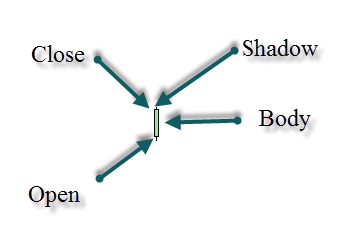
The real body is white/green if the close is higher than the open. This means the stock went up in value.
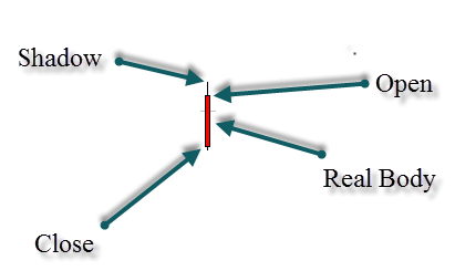
If the close is lower than the open the real body is black or red. This means the price of the stock went down.
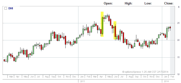
Using the size and colour of the real body also reveals the volatility that a stock traded at one point. The longer the candle the larger the range the stock traded in that time period. The smaller the body of the candle is, the less volatile the stock.
So if the red or black candles are long the sellers or bear trades are in control.
If it is green or white and long the bull market is on the run. The buyers are in control.
This is highlighted in the chart below.
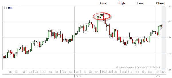
Additionally, when a candle is small there is a battle between the buyers and sellers of the stock. It can also indicate that a market trend may be losing momentum. The circled area (below) shows where the stock has lost momentum just after a huge price rise and is now turning direction.
CANDLE BODIES – SHADOWS, WICKS, DOJIS & REVERSALS
When the real body of a candle gets very small we can end up with a candlestick line which has an equal open and close. There is no real body in this instance. It is called a doji.
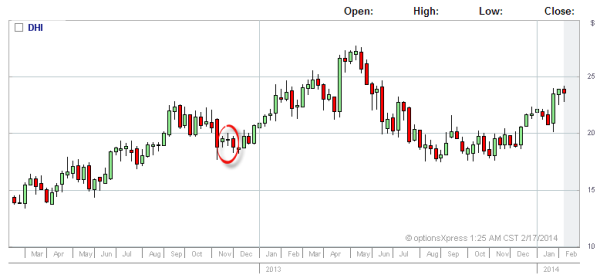
(The smaller candles in the red highlighted area demonstrate the tug of war between the bulls and bears. In the middle is the moment of indecision which is shown by a doji candle.)
On candles there are often thin lines above and below the real body. These are referred to as shadows or candlesticks. The top lines reveal the high price the stock reached while the market was open. The bottom shows the lowest price the stock reached while it was open. (Remember the body show the prices of the open and close.) The candlesticks/shadows show the range.
The length of the candle wick can determine what the market supported or resisted. For example, if there is a long top wick it can reveal the market didn’t support the higher prices. Conversely, if there is a long bottom wick the market did not support the lower prices.
This is important as candles can indicate when a stock may be turning. This information isn’t shown and harder to find in other charts.
This information can influence a trader in deciding whether to take a trade.
The shadows can show that there is a turnaround about to occur as a stock loses momentum. To a line chart reader it could be interpreted as a break out. In reality it could be a reversal.
A breakout is when a stock runs away in a momentum of a certain direction. A reversal is when it swings away and goes the opposite direction. What can occur prior to a reversal is the momentum of the direction may begin to wane.
What we must hasten to say is candles are merely a graph that shows how it tracked over a market session. The interpretation applied to them is ALWAYS at best an educated guess.
Many times I have seen charts and trades line up a certain way and the stock do the complete opposite of what the charts indicated it “might” do. The candle is merely a graphical representation. It is neither wrong nor right. The interpretation of what may occur could be wrong or right. Either way the market does what the market does. So it is an educated guess at best.
I’ve seen trades line up perfectly with all the indicators and once executed the stock do the exact opposite of what the indicators said it might do. Remember the market is never wrong!
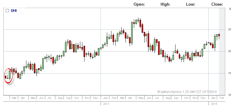
Below is an example of this situation. At the circled area of the chart you can see a form of doji called a gravestone. They are more common at market peaks than bottoms so what you are seeing is less common. It shows a long shadow at the top with now body showing uncertainty in the market on the price, with the sellers pushing down the higher prices at the close of trading. However, you can see by the chart and strong green candle following that market confidence restored, and it went bullish again.
Traders will often wait for this next candle to see if it confirms what the candles are indicating. This could have been a signal for many that it would fall further.
As I said you must bear in mind indicators are simply tools only, and the market can counter what the indicators are saying. A more conservative trader would have been grateful for waiting for a confirmation candle and seeing it wasn’t forth coming, whereas a more aggressive trader could have possibly been caught out.
As mentioned this article is simply an introduction to candles.
For more advanced formations you can look at “Piercing lines”, “Harami’s”, “Dark Clouds”, “Shooting Stars”, “Hammers”, “Tweezers” and more!
For further information these references may be of interest.
Blogs:
http://optionstradingbeginner.blogspot.com.au/2009/01/major-bullish-candlestick-patterns.html
http://optionstradingbeginner.blogspot.com.au/2009/02/major-bearish-candlestick-patterns.html
References:
http://candlecharts.com/about-candles-basics.htmlz
http://www.investopedia.com/terms/g/gravestone-doji.asp
http://optionstradingbeginner.blogspot.com.au/2009/01/major-bullish-candlestick-patterns.html
http://optionalpha.com/what-the-heck-is-support-and-resistance-for-stock-traders-and-how-can-i-use-it-9053.html