

Let’s face it! Life is getting more and more complicated. For all the fancy technological devices that are meant to save us time we actually don’t have more free time! We just fill it up with more things to do, or are expected to get more done in less time. It can be overwhelming and sometimes paralysing which is completely counter-productive. With all the communication we have, emails, text messaging, social media updating, mobile phones, and the ever increasing expectation to respond instantly; it can actually prevent us from getting things done.
Similarly with trading the key is to wherever possible, keep it simple! This is especially so when it comes to technical indicators.
The danger is a trader gets into “analysis paralysis” and doesn’t take action on any trades simply because they are overwhelmed with data.
Consequently with the next round of technical indicators I am going to limit the focus on Bollinger Bands, Relative Strength Index (RSI), and Fast and slow stochastic oscillator. These 3 are the key ones I personally use.
There’s nothing stopping you looking into others. However, it’s an easy trap for traders to fall into – ‘analysis paralysis’! Personally wherever possible, I like to keep it simple.
Bollinger Bands
Bollinger bands, or ‘bollies’ as we affectionately like to call them, were created by John Bollinger in the ‘80’s, and have become one of the most popular tools in technical analysis.
There are three bands which make up a Bollinger band – an upper, middle and lower.
They are used to highlight extreme short-term prices of a security or stock and are often applied to identify if a stock has been overbought or oversold.
When a candle pushes past the upper part of the band it is considered overbought. Directional traders may see this as a signal that it may be moving in the opposite direction. In other words they are looking for a reversal where the market is selling the stock off and the price of the stock will drop.
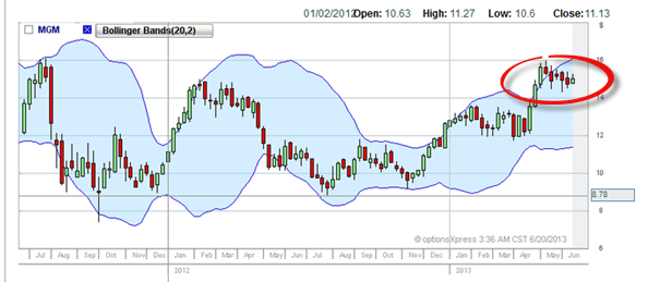
Conversely, when a stock pushes past the lower part of the band it is often considered oversold. Directional traders will be looking for an opportunity that sees the market change and begin to buy the stock back again.
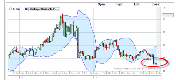
Very often traders may also wait for a confirmation candle to determine that there is a reversal going on. So in other words the candle has broken through the Bollinger band and they may wait for an opposite candle to confirm this direction. It comes down to how aggressive the trader is. This is always a personal thing. Each trader will have a different risk profile and/or trading strategy.
So when the stock looks like it is overbought and could now be sold off they may be looking for a red candle as confirmation.
Similarly if the stock looks oversold and the market looks as if it will buy it back the trader may look for a green candle as confirmation.
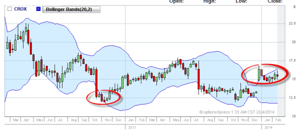
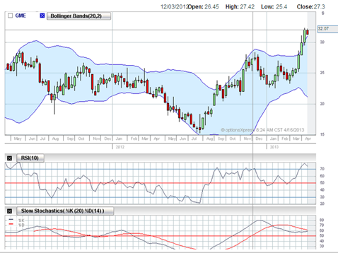
The above chart demonstrates when the Bollinger bands showed both oversold positions and overbought positions. The circle on the left shows when it was oversold and then rose. The highlighted circle on the right shows when the Bollinger bands were indicating it was overbought and then began to fall in price.
Relative Strength Index
Just as Bollinger bands are used to determine overbought and oversold status of a security so does the relative strength index. It mathematically compares the magnitude of recent gains to recent losses with the formula:

Relative Strength Index (RSI) ranges from 0 to 100.
What a trader looks for is when the indicator approaches either 30 or 70 on the index.
When it approaches 70 the position is getting overvalued and there’s a good possibility for the asset to be sold off. Conversely, if the asset is being oversold the indicator will approach 30. This is read as being undervalued and stock traders may get back into buying the stock again.
You must be aware a large price movement in either direction will affect the RSI. When the readings are out they can then affect how overbought or oversold signals are read.
This is why I combine the readings with Bollinger bands and stochastic.
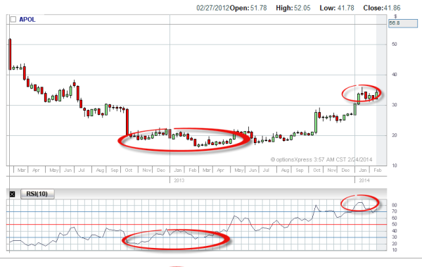
The above chart shows how when the stock was trading at $18. The RSI ranged between 20 and 30. This for stock traders is a buy signal.
On the upside you can see when the stock was $35. The RSI was peaking at over 70, even over 80, with a fall in the price shortly afterwards. For stock traders this is a signal to sell.
I’ve mentioned previously that you can make money no matter which direction the market moves.
Generally speaking when people are trading the market to go up it is referred to as ‘going long’. In other words they are buying the stock in anticipation that it will make them money due to a price increase. Their aim is to profit by selling it eventually at a higher price than they bought it for.
When it is ‘going down’ traders will often sell their positions. Some traders can sell even before they own the security. We refer to this as ‘going short’.
Think of it as an entrepreneur who collects orders before they have created the product. They want to test the market to see if it will buy, before going to the expense of setting it all up and discovering no one wants it. So what they may do is sell the product first, and if it takes off then create it. If it doesn’t sell, they refund the money to the few who bought the product. They cut their losses knowing they were minimal in comparison to if they had set up a full blown operation, only to discover there is no market for it.
Similarly, a trader can sell stock or contracts before owning them. If the price is going down they can sell it at higher prices as it tumbles knowing that when it hits a lower price they buy back the contracts at bargain prices, thereby making a profit. This is known as ‘shorting the market’.
So some directional traders may try to sell the stock when the indicators are showing the market may go ‘short’.
With the strategy I use I make money by selling up front while buying protection at the same time. I prefer to get paid first rather than buying something and hoping it will go up.
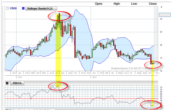
In the above diagram you can see how applying Bollinger bands with the Relative Strength Index provides matches. Additionally, the candles add further information to the momentum of the stock. In the first instance on the left there was a long bodied candle showing the stock was being bought. Then it was immediately followed by a strong candle body that it was being sold. The Bollinger Bands are broken at this time and the RSI is certainly indicating the stock was overbought with a reading of 80.
At the end of the chart the indicators are showing a big sell off occurring. The candle body is large and then suddenly becomes small, showing the momentum is slowing, and a buy back is happening. The candles breaking through the lower Bollinger band shows the stock is oversold, as do the low readings on the RSI index between 30 and 35.
Fast and slow stochastic
A stochastic compares the closing price of a security to its price range over a particular period of time. The sensitivity is either increased or decreased by adjusting the period of time it’s measured over by taking a moving average of the result.
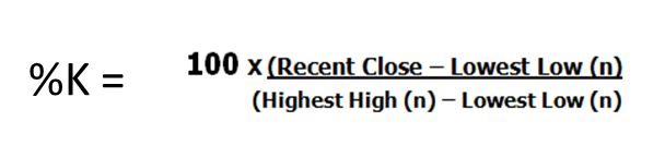
The mathematical formula for a fast stochastic is calculated as …
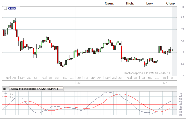
Many traders look for the lines crossing over as an indication the security is about to change direction. They are also referred to as transaction signals. In other words they buy or sell based on when they cross.
The difference between a fast stochastic and a slow stochastic is its sensitivity. One is mathematically calculated slightly differently than the other.
The above formula uses a 14 day reading which is used for fast stochastic. However many traders find it far too sensitive and either enter or exit trades too early. The slow stochastic instead uses a three-period moving average to the %K of the fast calculation. This for many traders gives them more accurate transaction signals, and reduced false crossovers.
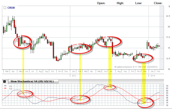
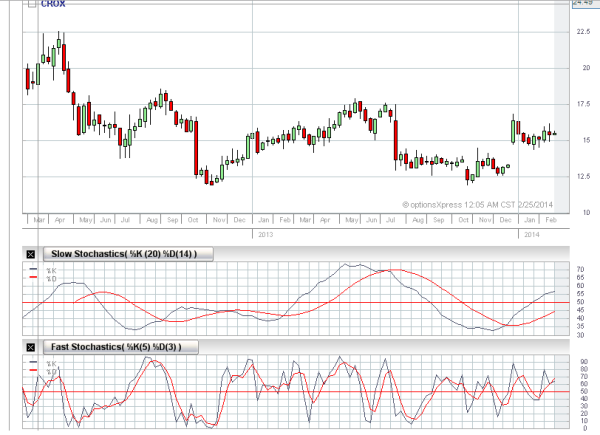
Above and below you can see that the red and blue lines cross during trends of different market direction. Generally the red line comes over the top when the stock is going down, and the red crosses beneath the blue line when it is going up. In this example we are using a slow stochastic.
Comparatively speaking the same chart when under laid with a fast stochastic demonstrates a lot more sensitivity in the readings. It’s obvious how this can be confusing for traders looking for entry or exit signals.
My friend once gave me an opportunity to drive his sports car. It was fast! You touched the accelerator and you were 0-60 kms in less than a second and that was just in first gear. It had a blow off valve, sensitive steering … it was just built for speed. With my limited racing experience I felt like I was behind the wheel of a big go-kart. This is how a fast stochastic operates.
Alternatively my 4 wheel drive has less sensitivity in its handling. It’s bigger and designed to take on rough terrain smoothly. On the normal road it just cruises. The wheels and body are sturdier than the sports car. It’s designed for strength and to make the ride less bumpy over rough places. This is similar to how a slow stochastic works.
Personally, when I am looking to take a trade I use a slow stochastic over the fast for the obvious advantages. I want clarity on crossovers. Additionally, stochastic indicators are generally ahead of the rest of the indicators, so I prefer to go with something a bit slower when considering whether to take a trade. I may use a fast to cross check, but I’ve learned to be careful to not ‘see into a trade’. It’s easy to try and see something that when you are objective is just not there. I find I have to ask myself what it is actually indicating as compared to what I would like it to indicate. This is particularly important if a trader is experiencing ‘Anxiety to Trade’. You psychologically want to get some trades in the market; you are looking for indicators to match. However you are so keen to get in, too often you can look for something that isn’t really presenting. It’s basically over reading and second guessing the market.
So how do you know whether you are getting a good technical reading or a bad one?
The key is to overlay all the indicators at the same time and cross check to see if they line up.
I set up my trading screens to do 14 day moving averages. I’ll call up the stock I want to look at.
I’ll start with the Bollinger bands, compare it with the Relative Strength Index (RSI), and a slow stochastic. In fact I’ve programmed my trading platform to default to all these settings.
If all the indicators are saying the same thing, then generally it’s safer to conclude the readings are accurate.
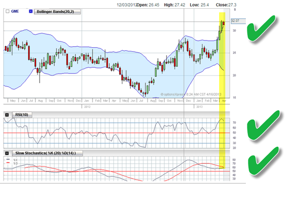
The above chart shows all the indicators lining up. The Bollinger band has been broken. There’s been a rally breakout which is now slowing. We now have a confirmation candle indicating the sellers are starting to out number the buyers. The RSI shows the position as overbought and the slow schotastic is indicating a turnaround. This combination and overlay of indicators can be interpreted as the stock is ready to fall.
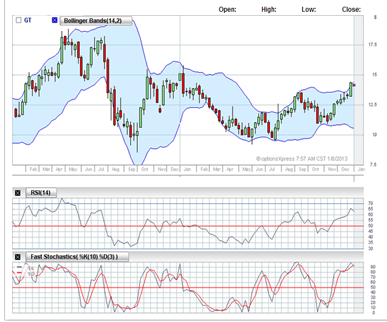
On the GT chart you can see the Bollinger band is broken at the top indicating that it is oversold. The RSI is near 70 with a downward trend. The fast stochastic in this case is starting to cross. There is a confirmation signal on the next candle the stock is going down. This combination suggests the stock is about to fall.
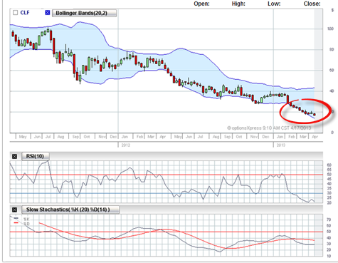
The above JCP chart shows the Bollinger bands have lined up correctly for a turnaround as has the RSI; however, the slow stochastic is getting an unusual reading. The lines have crossed, but it’s not clean. They are pointing downwards, but did not get a clear cross over for a long time. Personally, on this kind of reading I would look for a better trade with a stronger formation. I would also put this on my watch list and compare today’s chart with charts over the next few days, to see if there is more confirmation the stock is going up.
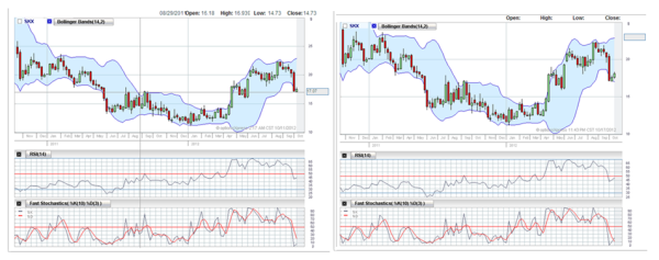
The two above charts are actually taken from some of my watch lists in 2012. They show on the left SKX trading at $17.59 on the 11th October 2012. Then just over a week later on the 18th it closed at $17.82.
Similarly the Bollinger bands are broken, the candles are getting a confirmation the stock is starting to go the other way. A week later there is a second green candle confirming this. The RSI isn’t near 30 in the first, but is showing an upward length. A week later the signal gets longer and the fast stochastic does finally cross over that time frame. You can see how a watch list can help you track how the stock is moving.
The combination of Eastern with Western indicators, using multiple indicators overlaying each other, all help in analysing what the stock may do next.
Again, at best indicators are an educated guess. I can’t emphasise this enough. I have seen everything line up perfectly before, and the stock do the complete opposite of what the indicators said they would.
Personally I find directional trading on its own is difficult. Sometimes you get it right, and sometimes you get it wrong. This is why I combine it with a probability strategy which we’ll go into at a later part of the course.
Nevertheless I’ve found indicators a complimentary tool in deciding whether to take a trade.
We’ve emphasised before that indicators are simply a guide and to be always treated as so.
References:
Tales From The Trenches: A Simple Bollinger Band Strategy – May 09 2007
http://www.investopedia.com/articles/trading/07/bollinger.asp#axzz1yLIcgkAN http://www.investopedia.com
http://www.investopedia.com/ask/answers/05/062405.asp